Width
Ladle is responsive by default, so to test your components for different screens you can use your browser's dev tools. However, Ladle also provides an addon to streamline this workflow even more:
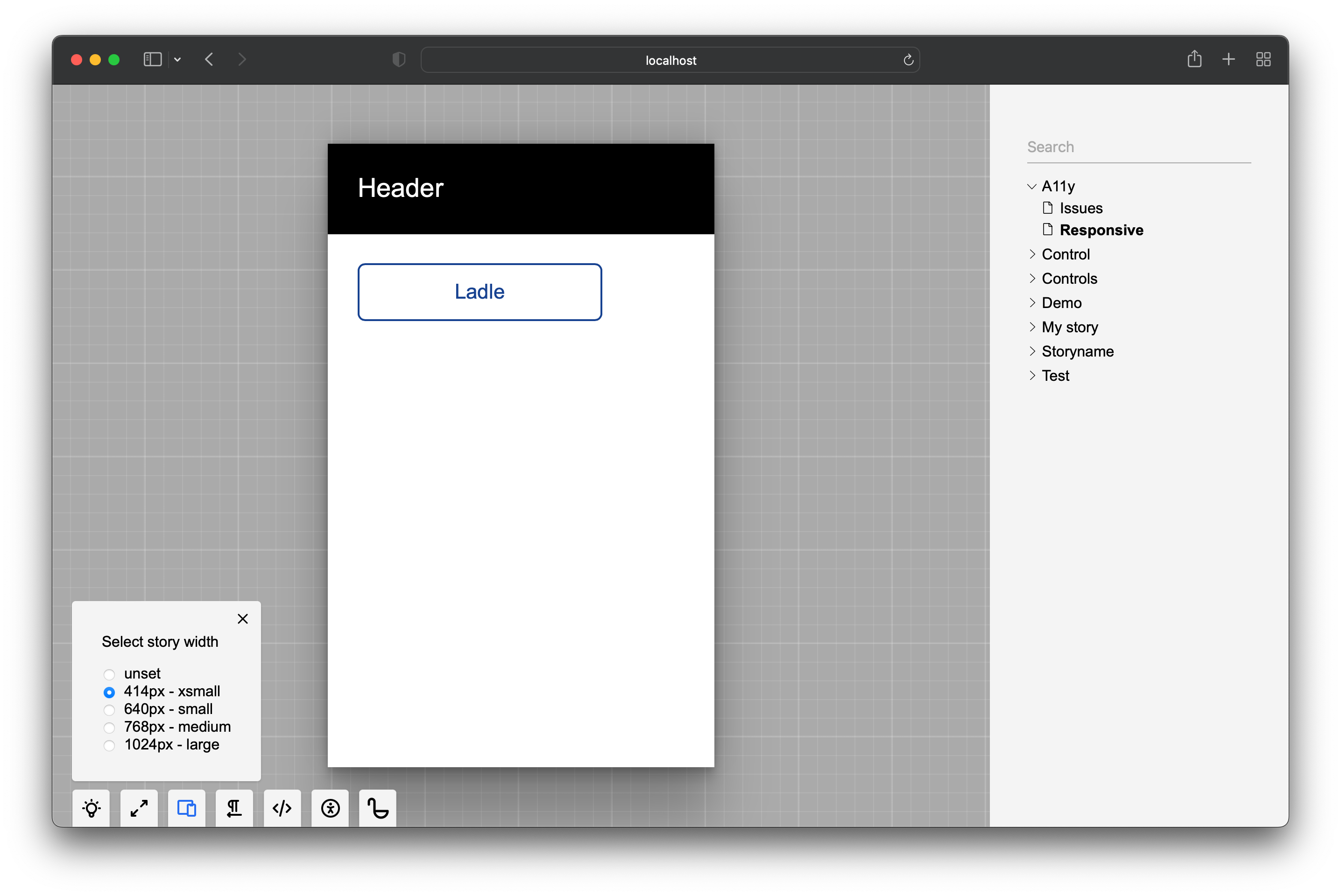
You can use these default viewport widths (px):
{
  xsmall: 414,
  small: 640,
  medium: 768,
  large: 1024,
}
An application might need to optimize for a different set of devices, so you change the defaults through the .ladle/config.mjs configuration:
/** @type {import('@ladle/react').UserConfig} */
export default {
  addons: {
    width: {
      options: {
        phone: 380,
        tablet: 720,
        large: 1200,
      },
      enabled: true, // the addon can be disabled
      defaultState: 0, // default width in pixels (0 = no viewport is set)
    },
  },
};
Default values
You can set the global default (above) or per-story via meta:
import type { StoryDefault, Story } from "@ladle/react";

export default {
  meta: {
    width: "xsmall", // name or number can be used
  },
} satisfies StoryDefault;

// viewport width = 414px
export const First: Story = () => <h1>First</h1>;

// viewport width = 345px
export const Second: Story = () => <h1>Second</h1>;
Second.meta = { width: 345 };
The number value doesn't need to match the configured set. In that case, the addon popover will display an additional custom - 345px item.
Iframe
Ladle doesn't normally use iframes around your stories but to make this addon work, it has to. It should not change anything for you other than a slightly different debugging experience.
Some story components like modals might use the entire screen and cover Ladle's navigation. If you want to restrict the story's space, you can activate the iframed version of Ladle even without specifying a viewport width:
import type { Story } from "@ladle/react";

export const Modal: Story = () => <FullScreenModal />;
Modal.meta = { iframed: true };
Preview Mode and Testing
When you switch Ladle to the preview mode, this addon is disabled since the Ladle UI isn't available and the story takes up the full screen. For testing with Playwright, you can set the viewport width within the test:
import { test, expect } from "@playwright/test";

test.use({ viewport: { width: 600, height: 900 } });
test("my portrait test", async ({ page }) => {
  // ...
});
Also, note that all meta parameters are accessible through the meta.json endpoint - something you can take advantage of when automating your tests.